Direct answer
A good landing page communicates the offer within a few seconds, asks for exactly one action, backs itself up with specific and real proof, loads fast on mobile, and reads like it was built by an actual business rather than a generic template. Real web designers and business owners on Reddit’s r/webdesign lined up on these points almost exactly, and 2026 conversion data backs every one of them up.
If you search “what makes a good landing page,” most articles repeat the same four words: clarity, design, speed, trust. We wanted a more grounded answer, so instead of guessing, we looked at an actual conversation among web designers, marketers, and business owners on Reddit’s r/webdesign, where someone asked a simple question: if you were a consumer or a small business, what would you actually look for in a landing page, and what would you expect to pay for one? The responses lined up more consistently than expected. Here is what they said, checked against 2026 conversion benchmark data so none of it is just opinion.
What people actually said mattered
Across the real responses in that thread, five themes came up again and again, ranked here by how often they were mentioned:
| Theme | How often it came up | What it means |
|---|---|---|
| Clarity | Majority of commenters | Visitors decide almost instantly whether a page is worth their time |
| Proof and trust signals | Nearly half | Reviews and real examples over marketing buzzwords |
| One clear next step | Almost half | A single obvious action, not several competing calls to action |
| Mobile speed | Several | A fast, working page beats a flashy, slow one |
| Feels human, not templated | A couple, unprompted | A specific concern in the AI content era |
That is a small, informal sample, not a scientific survey, so treat it as a snapshot of what people in the industry are thinking about right now rather than a statistically representative study. It lines up closely with what large-scale conversion research has been finding for years, which is the more interesting part.
1. Clarity wins over design every time
The single most repeated idea in the thread was not “make it beautiful.” It was some version of: I should understand what this business does, who it is for, and what to do next, within a few seconds, or I am gone.
One person working at a marketing agency put it plainly: a landing page can look gorgeous, but if the visitor cannot figure out the offer fast, the design is not saving it. Another commenter said they want to know how much sales copy they have to wade through before reaching the actual substance, what the service is, how it works, and what it costs.
This tracks with the data. Unbounce’s 2026 benchmark analysis of 41,000 landing pages and 464 million visits found that pages with a single, clear call to action converted at 13.5%, compared to 11.9% for pages with two to four competing links, and worse the more links you add. Confusion has a measurable cost.
Takeaway: write your headline as if it is the only sentence someone will read. It should say what you do, who it is for, and why it matters, without making the visitor work for it.
2. One goal, one CTA, message match
Several commenters independently landed on the same structural point: a landing page should not try to sell six things at once, and it needs to continue the exact conversation the visitor started when they clicked in. If your ad promises one thing and the landing page talks about something else, trust breaks immediately. This is sometimes called message match, one of the most well-documented conversion factors in digital marketing, and one of the easiest things to get wrong when a page gets reused across multiple campaigns.
3. Proof beats buzzwords
Reviews, testimonials, case studies, and specific examples were mentioned repeatedly, always with the same caveat: it has to be real, not vague claims like “industry-leading” or “best in class.” One commenter said they specifically look for two solid testimonials or concrete examples over generic marketing language.
This matters more now than it used to. With AI-generated content everywhere, generic-sounding claims read as suspicious rather than persuasive. Specificity is what signals a real business is behind the page.
4. Speed and mobile experience are not optional
A couple of commenters flagged mobile responsiveness and load speed as things that still get treated as an afterthought, which is surprising this late in the game. The data backs up why that is a mistake:
- SpeedUnbounce found pages loading in under 3 seconds convert 32% higher than slower pages
- MobileHubSpot’s 2026 report found the average mobile page converts at 2.8%, versus 4.8% on desktop, largely due to friction, not lack of interest
- ImagesOversized, unoptimized images were directly linked to lower conversion rates across Unbounce’s dataset of nearly 19,000 pages
If your landing page looks great on a laptop but takes four seconds to load on a phone, you are losing people before they see any of the careful design work.
5. It has to feel like a real business made it
This came up unprompted from more than one person, and it is a genuinely new concern: landing pages that feel like they were spun up from an AI template with no thought behind them. People want to sense that an actual business, with an actual point of view, built the page. That comes through in specific language, real photos over generic stock imagery, and a tone that sounds like a person rather than a marketing algorithm.
6. Do not design on assumptions, watch real behavior
One useful point that does not come up in most landing page checklists: what people say they want and what they actually do on a page are often different things. A commenter with hands-on conversion optimization experience recommended using heatmaps and session recordings to see where real visitors drop off, rather than relying purely on assumptions about what should work. If you have any meaningful traffic, this is worth doing before spending a lot of time polishing visuals visitors may not even scroll to see.
What should a landing page actually cost?
This is the part small business owners usually cannot get a straight answer on, so it is worth quoting directly from people who do this work. Two independent commenters gave very similar real-world ranges for a small business landing page:
$300 to $1,000, depending on design, copywriting, and integrations, per one estimate.
$300 to $1,500, depending on copy and photography needs, per another.
Both numbers are for a simple, single-purpose landing page, not a full multi-page website with e-commerce, custom integrations, or ongoing optimization. If your project needs strategy work, custom development, tracking setup, or conversion testing on top of the page itself, expect the cost to climb well beyond that range. As one agency-side commenter put it, a landing page is not a tiny website. It has one job, and pricing should reflect whether you are paying for a nice-looking page or a page built around an actual conversion strategy.
Step-by-step: how to build a landing page that actually converts
- Define one goal. Before any design work, decide the single action you want a visitor to take. Book a call, buy a product, fill out a form. Everything on the page serves that one goal.
- Match your message to your traffic source. If someone clicks an ad, email, or social post to get here, the headline should continue that exact conversation, not introduce a new one.
- Write the headline first. It should communicate what you do, who it is for, and the benefit, in one sentence a stranger could understand in five seconds.
- Put your CTA above the fold. Visitors should not have to scroll to find out what you want them to do.
- Add real proof. Two to three specific testimonials, a case study, or concrete examples beat five vague trust badges.
- Cut competing links. Remove navigation menus, footer link farms, and anything that gives visitors an exit that is not your CTA.
- Optimize every image. Compress files, use modern formats, and test load time on an actual phone on mobile data, not just wifi on a laptop.
- Test the mobile experience end to end. Tap through the entire flow, including any forms, on a real phone before launch.
- Watch real behavior after launch. Use a heatmap or session recording tool for the first few weeks and adjust based on where people actually drop off, not where you assumed they would.
- Keep revising. A landing page is never really done. Small copy and layout changes compound into meaningful conversion gains over time.
Landing page structure template
Use this as a section-by-section blueprint. It reflects both what commenters said they look for and what conversion data consistently supports.
- Header: logo and, at most, one or two navigation items, or none at all for a pure conversion page
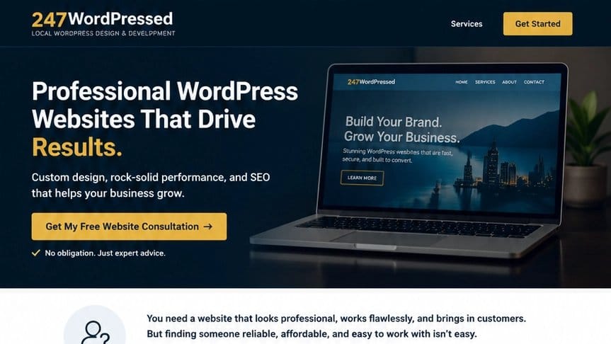
- Hero section: clear headline, one-sentence subheadline, single CTA button, supporting image or short video
- Problem or context: one or two sentences confirming you understand the visitor’s situation
- What you offer: plain-language explanation of the product or service, no jargon
- Proof section: two to three specific testimonials, a client logo row, or a short case study
- How it works: three to four simple steps showing what happens after someone converts
- Objection handling: answer the two or three questions visitors are most likely to have, pricing, timeline, guarantees
- Second CTA: repeat the same single call to action, worded slightly differently
- Minimal footer: contact info and trust elements only, no distracting links back into a full site
Common mistakes that quietly kill conversions
- —Scrolljacking or forced animations that slow visitors down, specifically called out as a dealbreaker in the thread
- —Multiple competing CTAs asking for different actions
- —Stock photography that looks like every other page in your industry
- —A full site navigation menu bolted onto what should be a focused, single-purpose page
- —Generic claims with no specifics behind them
- —Treating mobile as a smaller version of desktop instead of testing it directly
Frequently asked questions
What are the key elements of a good landing page?
A clear headline, one obvious call to action, real proof such as testimonials or examples, fast load time, and a mobile experience that has been tested directly on a phone, not just resized from desktop.
What makes a landing page effective?
Message match. The page needs to continue the exact conversation the visitor started when they clicked an ad, email, or link, without introducing new information they were not expecting.
What should I prioritize in landing page design?
Clarity first, then a single clear next step, then proof. Visual polish matters, but it comes after the visitor already understands what you are offering and why they should care.
What features improve landing page usability?
Short forms, large tappable buttons on mobile, fast image loading, and removing any navigation that is not the main CTA.
How much should a small business expect to pay for a landing page?
Based on real quotes from working designers, a straightforward landing page typically runs $300 to $1,500, depending on copywriting and photography needs. Anything involving custom development, integrations, or ongoing optimization will cost more.
Summary
A landing page that converts is clear within seconds, asks for one action, proves its claims with specifics instead of buzzwords, loads fast on a phone, and reads like a real business built it. Expect to pay $300 to $1,500 for a straightforward version, more once strategy, custom development, or ongoing testing are part of the job.